

 ahmadraza54gb@gmail.com
 ahmadraza54gb@gmail.com
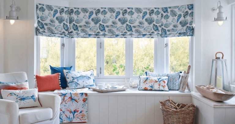
When it’s about controlling hundreds of articles, product pages for web shops, or user profiles in social networks, all
 ahmadraza54gb@gmail.com
No account yet?
Create an Account